Web Fundamentals
Taught by
Alexandra Ackerman
Code available at
https://github.com/newschool-webfundamentals
Presentations available at
newschool-webfundamentals.github.io
Agenda
- Introduction to grids
- Live-code a website using a grid system
- Your turn to use grids!
- Discuss homework
Introduction grids & responsive design
Why should we design websites for different devices?
Nearly 2/3 of Americans have smartphones, 68% of which use their phone at least occasionally to follow along with breaking news events
 PEW research center

So far, we haven't been conscious of how content looks on different screen sizes. Today, we'll fix that.

Web developers have 3 ways they make content look good on different devices
- Fluid layouts
- Adaptive design
- Responsive design
Fluid layouts
Typically refers to a grid system using relative values (percentages)

We'll go over this today!
Adaptive and responsive sites both change appearance based on the browser environment they are being viewed on (usually caring about width of screen)
Adaptive sites
Adapt to the width of browsers at specific points
ExampleResponsive websites respond to the size of the browser at any given point. No matter what the browser width may be, the site adjusts its layout
Responsive sites
Are more universal, but tricky to pull off.
ExampleToday we're going to talk about fluid layouts, because we know the context and size of the device we're designing for: phones
Knowing this context, there are break points using CSS for how the style should look at different screen widths.

Let's talk about grids

What is a grid system?
A structure that allows for content to be stacked both vertically and horizontally in a consistent and easily manageable fashion.

Grids help readers
A system to structure and present content and imagery in a much more readable, manageable way.

Uniformity and consistency are key to creating a website that your users will find easy to navigate, read and understand
Grids have two components
Rows & Columns
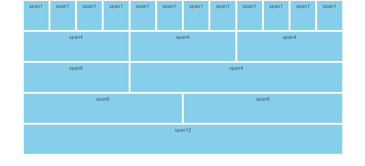
Rows take up space horizontally and accommodate columns.
Columns take up vertical space and hold your content.
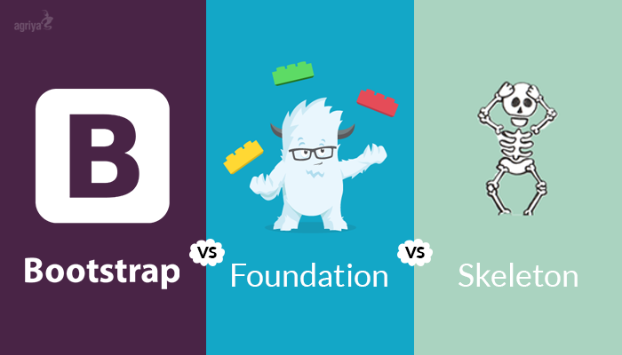
There are many frameworks that use css to create grid system
Why do developers like grid frameworks?
- Increased productivity
- Versatility
- Ideal for responsive layouts
Increased productivity
No need to keep writing CSS to fit your needs. Have a simple toolkit that lets you write code fast.
Versatile
Can mix and match the structure of content on a page to fit any need.
Ideal for responsive layouts
Incredibly easy to make content match to any size viewport.
Today we'll be using Materialize
Materialize is a HTML, CSS and JS framework for developing responsive projects on the web made by Google
Materialize goes beyong grids. Has CSS & JavaScript for many use-cases


Let's see an example site using a grid system

Before we move forward, discuss viewport
- The viewport is the user's visible area of a web page.
- The viewport varies with the device, and will be smaller on a mobile phone than on a computer screen.
Always add this meta tag to your html files, to adapt to mobile views.
<meta name="viewport" content="width=device-width, initial-scale=1">
Let's code a website using Materialize
Lab
 https://github.com/newschool-webfundamentals/materialize-lab